Interlude Home
Photography by:
Brian Quinby

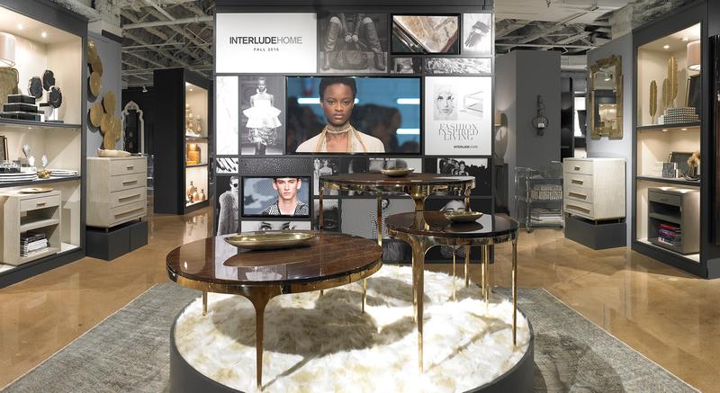
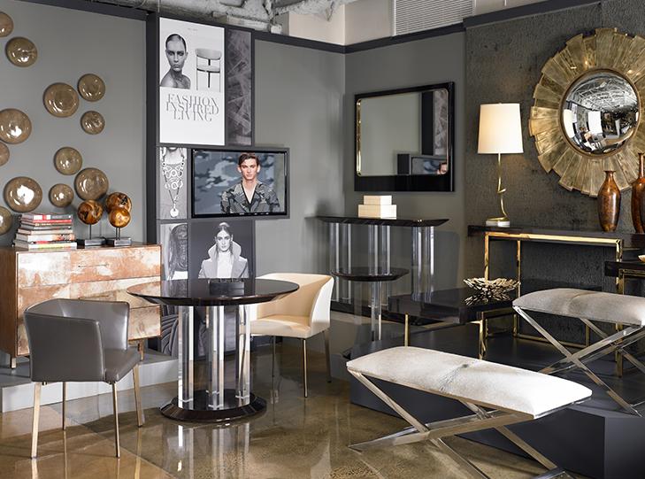
Creating a neutral, non-distracting space proved to be a winner. Dark and dramatic walls allow the merchandise to be the hero. The reduction of product density also allows more room for individual pieces to be appreciated for their design.


The Interlude showroom was an excellent opportunity for Idol Design to think strategically about showroom merchandising and design an experience that continues to delight guests and sell products.
